
Easter eggs aren’t the only things that look great in pastel — your interiors are a fabulous place to experiment with these springtime shades! Pastels can have a calming yet romantic feel and their light saturation makes them a timeless yet fresh interior design choice.
Though the pastel aesthetic is nothing new — they were popular as far back as the 18th century and often used in decorative Rococo interiors — there has been something of a modern-day revival. Recently, pastels have been seen all over the runway and social media, and the trend is definitely making its way back to home décor as well as light pinks, mint green, and lavender shades are becoming popular colors for walls, furniture, throw pillows, and more.
If you’re up for going outside of the box, consider incorporating pastels into your own home. These eye-catching shades are sure to brighten spaces and take your rooms to the next level. Take a look at these recent projects with pastel shades that pack a punch!
– All photos are from projects by Beth Haley Design (BHD).
Pale Pink
A passion for pink is the focus of this feminine home. The creative yet soothing pink hue is made even more visually interesting with a variety of textures, shapes, and layers. Adding curved lines, hints of mid-century design, and soft complementing colors enhance the feminine feel in the room and complete the look. Plus, keeping the window trim and shelves a natural color harmonizes with the pale pink and gold finishes.

In this home’s design, the client wanted to incorporate her favorite color — pink!
Light Lavender
This pastel lavender hue is a stunning accent color in an all-white bathroom. Neutral colors, such as white, ground pastel shades and prevent the room from being overwhelming. The light purple cabinetry brings an unexpected pop of color and adds a layer of fun. Now, it will always feel like spring in this bathroom — no matter what the weather looks like outside!

This pastel bathroom exudes gentleness and positivity!
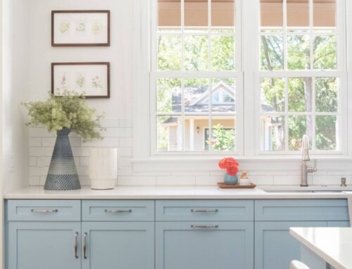
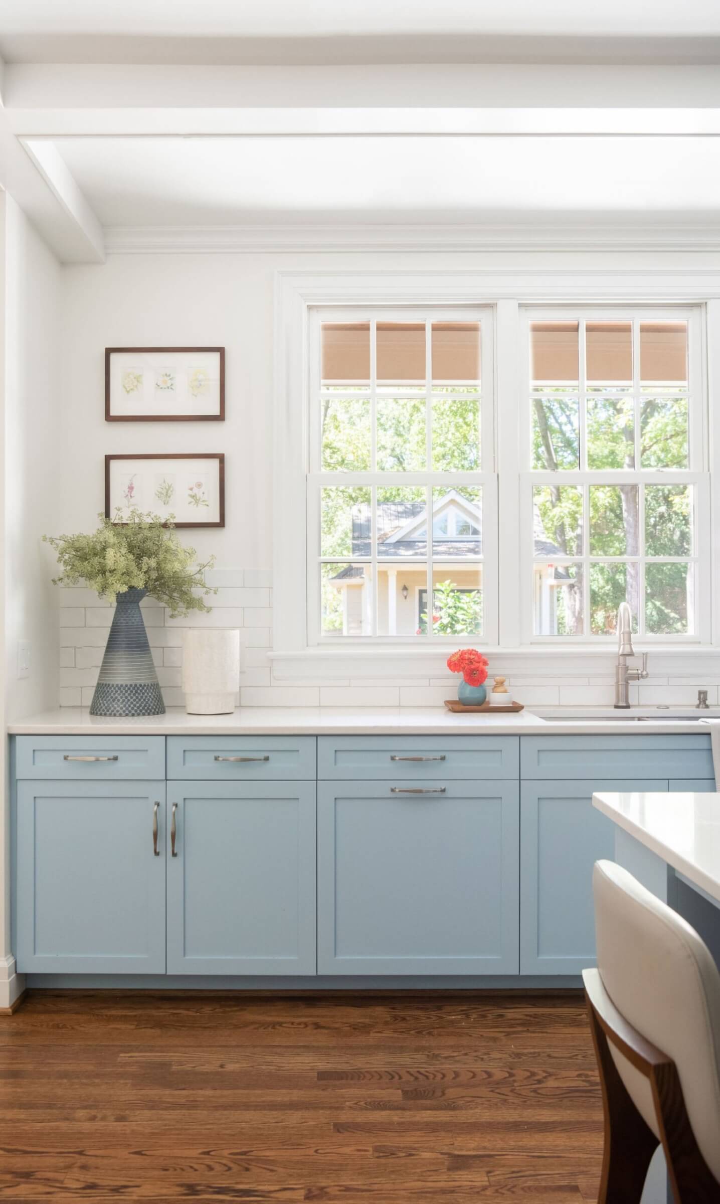
Powder Blue
Shades of blue can create feelings of freshness and calmness. This desired outcome was achieved with these beautiful powder blue cabinets. Combined with elegant marble tops and a clean white subway tile splash, this is a kitchen you will never want to leave! While cheerful and uplifting, keep in mind that the perfect shade of pastel blue can be difficult to select. Pastel colors can appear differently depending on how the light hits them. Consider doing a patch test to ensure you like how the color looks after you apply it.

A powder blue kitchen creates an aura of relaxation in a place that can often be bustling with action.
Mint Green
This whimsical bathroom design is perfect for our client’s young daughter. Mint green cabinetry, complemented by additional pastel shades, makes the sunny bathroom feel light, airy, and playful. Colorful framed artwork and hand towels bring everything together. It’s all about the details!

This bathroom is full of color! The pastel shades complement each other and bring out unique features in the individual components of this design.
We hope we have provided plenty of pastel inspiration to get you started. Now it’s time to introduce a variety of delicate pastels into your own home!
——––
Discover more of our blog posts here, as well as this feature in StyleBlueprint, where we are mentioned as one of the best interior designers in Nashville. We’d love to work with you if you are looking for professional advice! Please contact us here!