

Here at Beth Haley Design, we take an unapologetic approach to color. Pastel pinks, butter yellows, rich reds, vibrant tangerines, light lavenders, and chartreuse greens are only a few of the favorites on our spectrum. Beth invites you to be daring in your color choices, and explore the many ways in which color can be applied to
COLOR + ARCHITECTURAL DESIGN
Of course, paint has its place on the wall, but Beth also proves it can be used in myriad manners to enhance architectural detailing and round out a design. In the spaces below, bold colors — punchy pink, mustard yellow, crimson red and cobalt blue — were thoughtfully chosen to highlight singular architectural traits.

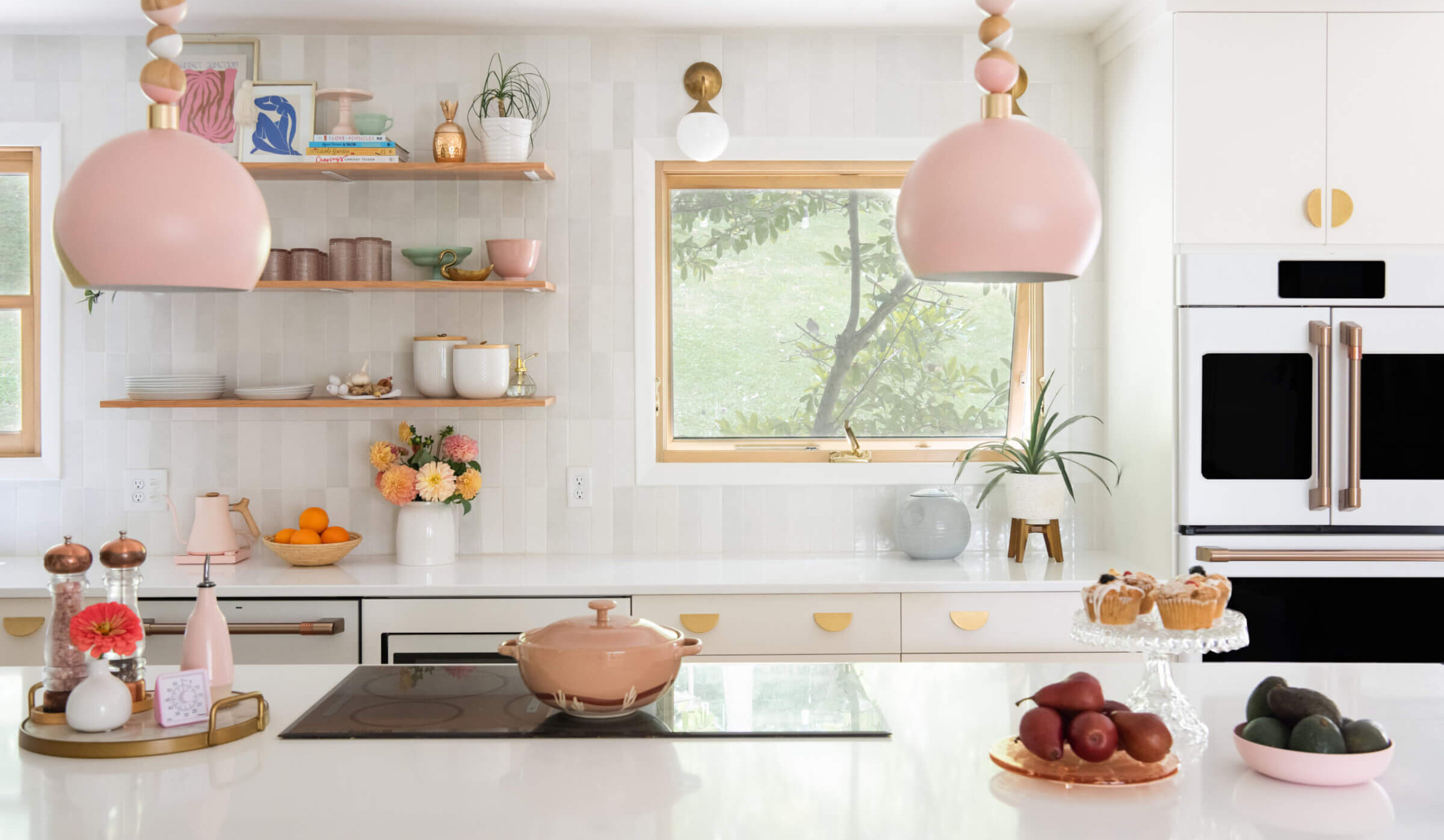
In a home full of statement spaces, there is a prevalence of vibrant hues. In this eye-catching corner, a particularly perfect shade of pink is added to enhance the architectural drama of the gridded windows. The colorful component complements the contemporary elements of design scattered throughout the home.

A bright burst of blue attracts the eye and offers a vibrant welcome on the front porch. The use of bold color outside gives a taste of what you will find inside. In a home so decidedly dedicated to color, it is only fitting that every space is packed with panache.

The unusual lines might pose a problem for some, but Beth called attention to the unique use of space by painting the wall a calming shade of blue. The color evokes feelings of relaxation, which is ideal in a bathroom such as this. Color is incorporated in an unexpected way, again, with art that hangs above the tub.

Contrasting colors celebrate the unique architectural lines in this living area. The unpredictable pairing of colors catches your attention without competing with the views they so perfectly frame. This space offers a welcomed reminder that primary colors are meant to be mixed and matched.

Cozy up next to this colorful fireplace and embrace the beauty of color incorporated unexpectedly. The rich detailing and layers of color create a focal point that invites conversation. Needless to say, we are green with envy over this fireplace.
Keep up with our latest design discoveries and inspiration by signing up for our emails!
——––
Follow us on Instagram to discover the beauty of COLORFUL, stimulating, sustainable and functional spaces.
