
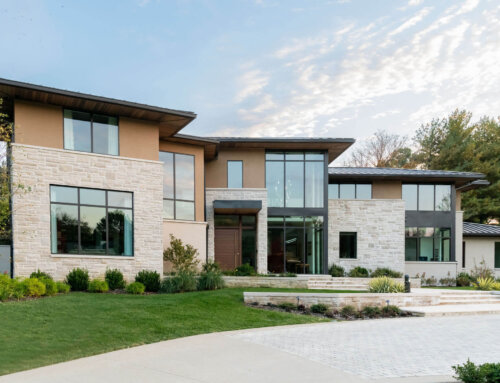
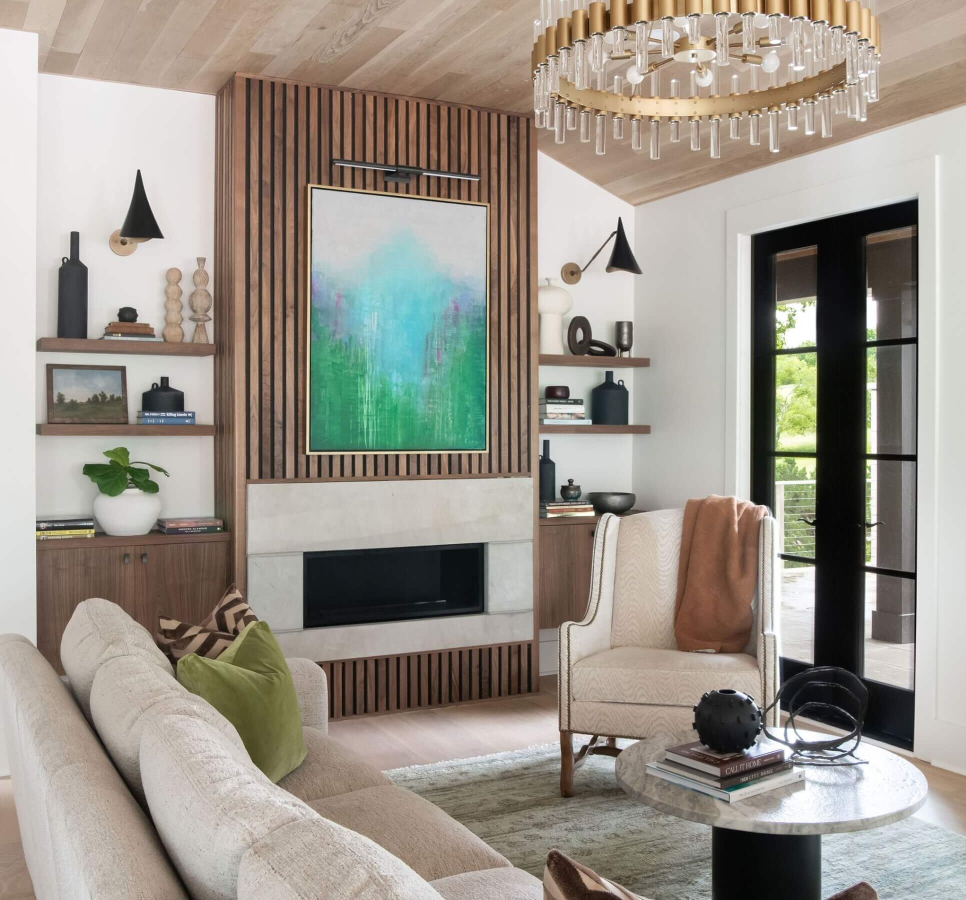
As we begin to experience the subtle shift in seasons, paired with the evolution away from all-white interiors, we look to color. One color always on our mind, and on our inspiration boards, is green. Greens range from bright lime to approachable pear, and we find ourselves in the middle: in the land of chartreuse.
For as long as she can remember, Beth Haley has gravitated towards the rich color of chartreuse green. “Chartreuse green’s fresh essence has always reminded me to stay true to who I am and not be afraid to be different,” Beth explains. “Like new, spring grass, chartreuse is a reminder of the newness that comes with each day. So, take each new day and express yourself, share your own uniqueness and surround yourself with what makes you happy.”

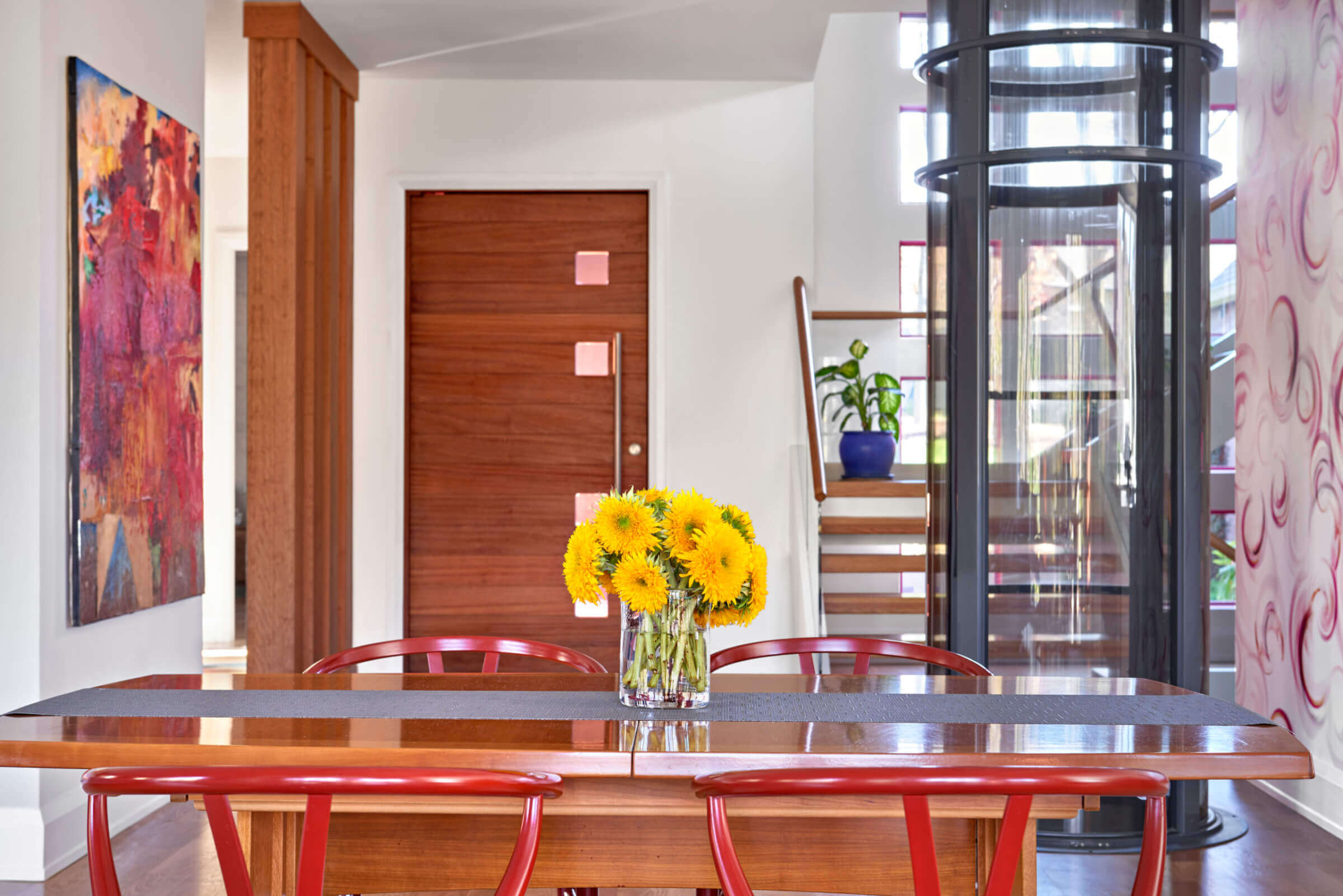
We aren’t the only ones gravitating towards green. The images below make a strong case for the use of this specific color. Join us in obsessing over chartreuse and add these images to your inspiration board — and we will be doing the same.

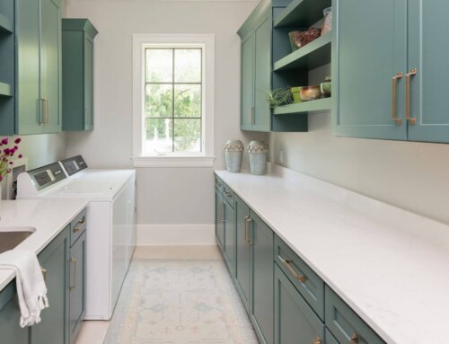
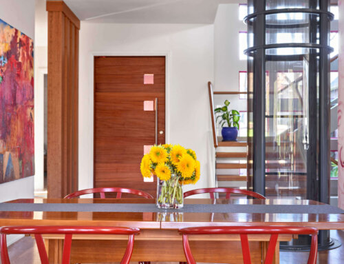
Bold color need not be reserved for accent pieces. Go bold, and bring color into any space in unexpected ways.

The famed French liqueur is full of character — and color. Pour us a drink, please.

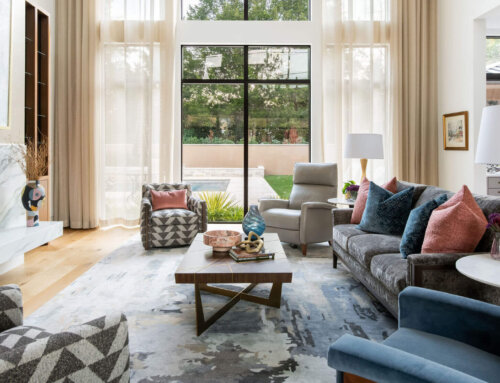
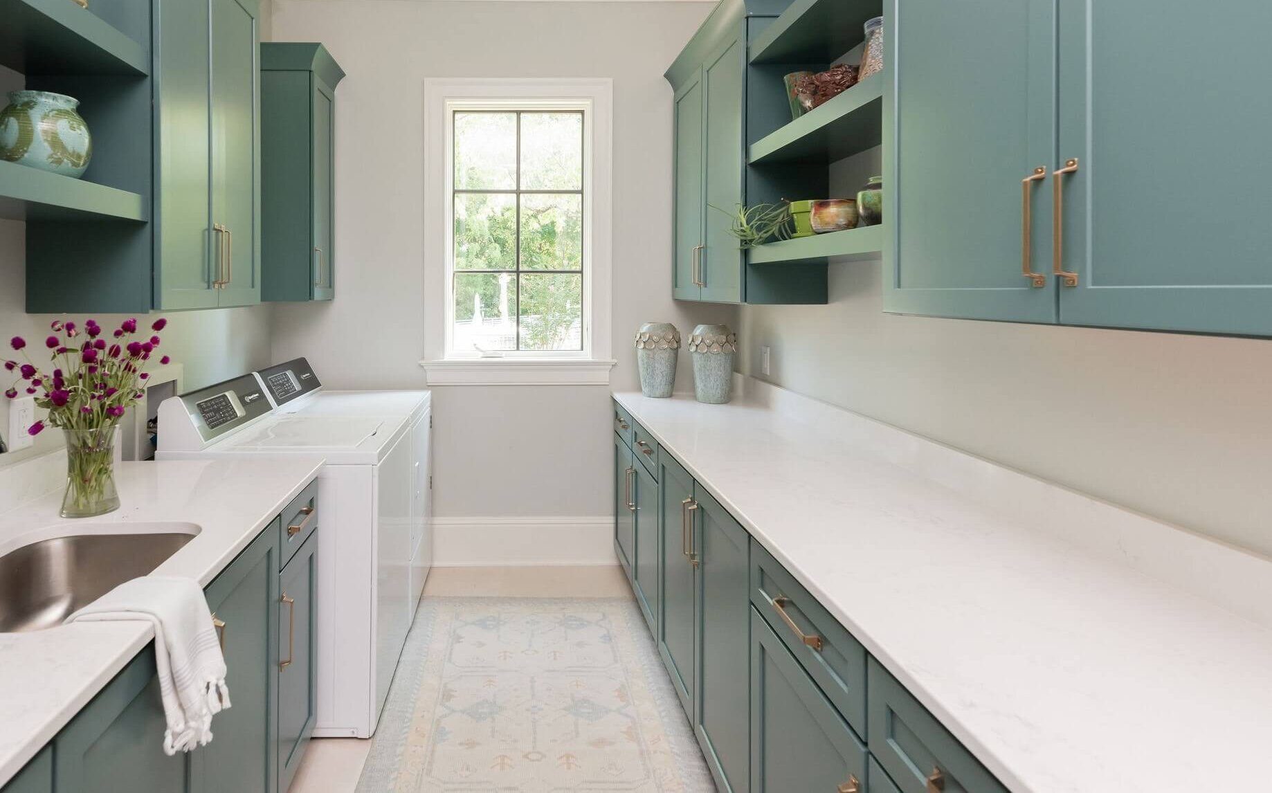
We brightened this space by painting the ceiling and pairing the paint with fabric that matches.

Incorporate color into all aspects of your life — including fashion.

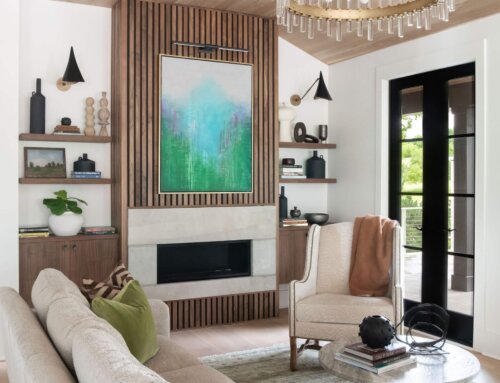
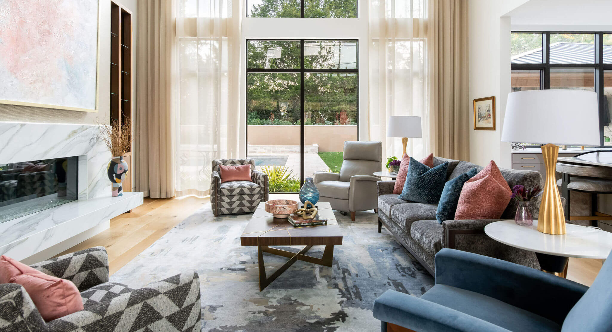
We appreciate the pairing of chartreuse and orange. Sam Allen Interiors smart use of color and thoughtful pairing makes for a dramatic space.

Looking to the landscape provides endless inspiration.

We are taking note of Amie Corley’s use of green in floor-to-ceiling drapery and lusting after those hardwood floors.