

Yellow should not be overlooked when it comes to adding color to your décor. Blues and greens are more commonly used in interior design while yellow can feel more fitting for accent pieces or citrus fruit — but we challenge you to consider this bright color for your next redesign. From creamy corn to mustard to lemon, yellow belongs on your sofa and your walls, in your closet, on your table, and even on your front door. Of course, such a bold shade should be used sparingly and smartly. The bold color pairs best with greys and neutrals, but we’ve seen it live alongside pink, greens, light blue, teal, and even cherry red. It brings warmth and dimension, so don’t be shy.
Whether gearing up for a redesign or just looking for inspiration, you’ll be delighted to see why Beth Haley can’t stop crushing on this fun color.
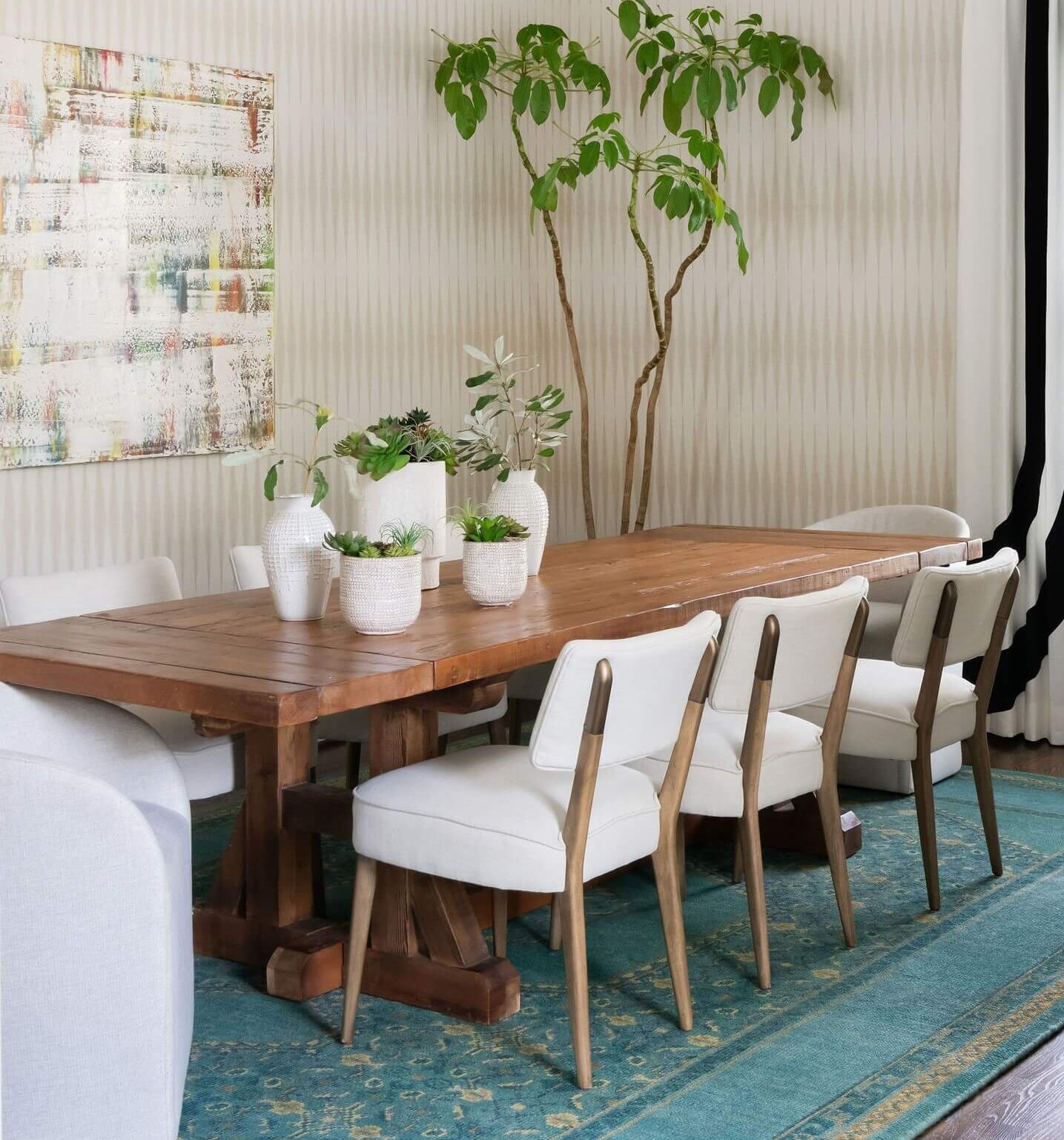
Yellow Design Inspiration

Mud Australia makes simple, durable, and beautiful dishware in a range of hues — including this delicious shade of yellow. Paired with the tablecloth and backdrop, this dishware is a yellow lover’s dream.

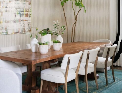
Often, Beth Haley uses yellow as an accent color to bring brightness into an otherwise neutral space. Here, the color (found in the stools, accent piece, and art) pops against an all-white background.

Another simple way to introduce the color into your design: fresh flowers. Beth Haley completed this color-soaked design with a simple bouquet. We love the way the yellow plays with the reds and pinks, and we’d even consider adding a yellow centerpiece that lives forever. 
This yellow skirt inspired us to add more yellow pieces to our wardrobe. Nothing can brighten a drab and dreary day quite like a bright, playful skirt. Plus, it only makes sunny days that much more fun. 
Taking a risk to incorporate a yellow couch as a focal point was a risk that paid off for this daring homeowner. As we mentioned, the color pair perfectly with greys. How much more evidence do you need?

Image by Aneta Pawlik
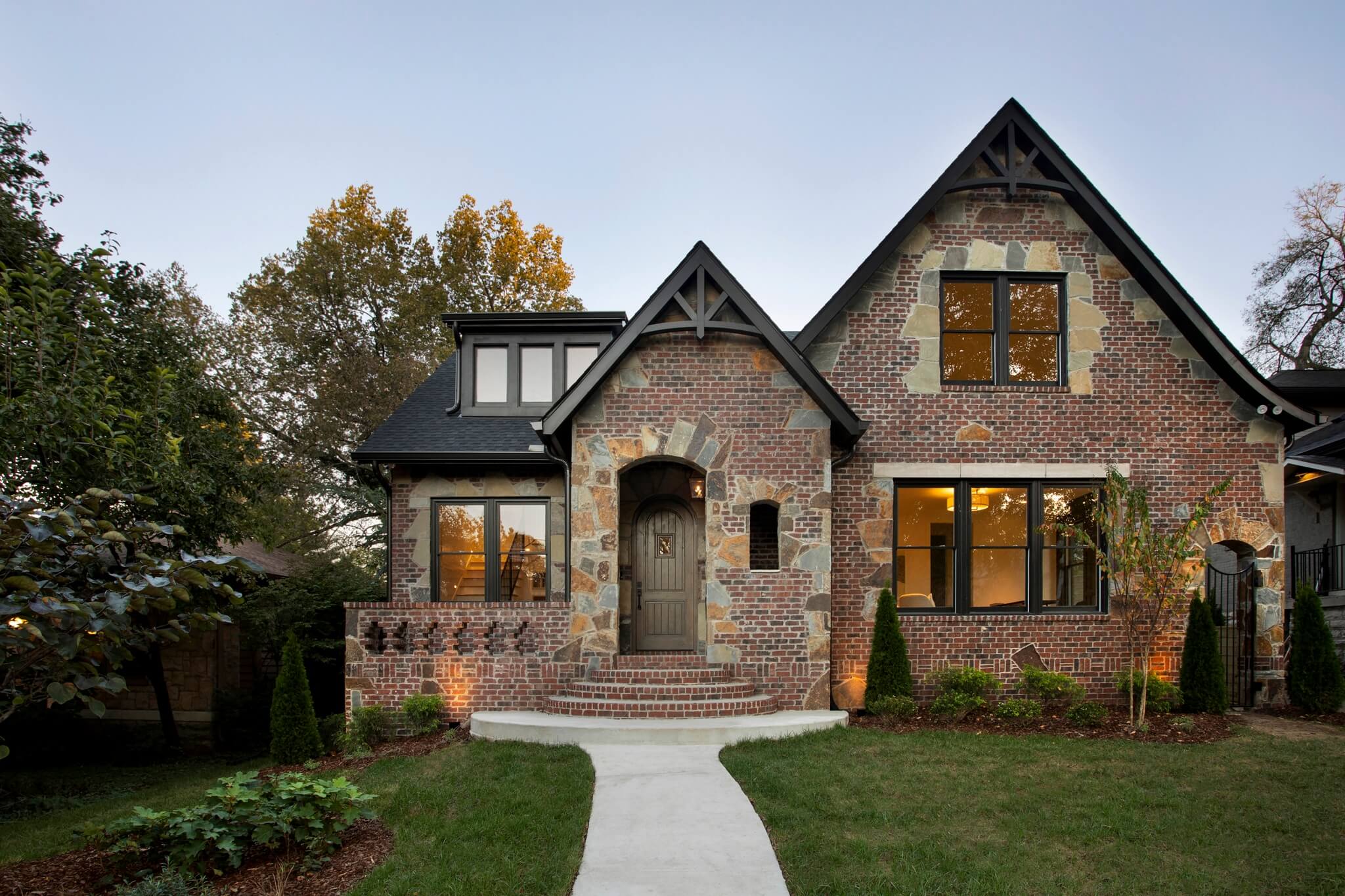
A little yellow goes a long way. The not-to0-bright shade of yellow frames the windows and doorway for a look that is show-stopping. We wouldn’t mind calling this Austrian home our own.

The color of this wallpaper lives somewhere between yellow and green, and it creates an accent wall in a walk-in closet. Again, greys and neutrals work well with the color to create a cohesive color scheme.
Are you willing to add a touch of yellow to your space? Don’t be color-shy. Instead of an all-yellow room, start with something simple, like fresh flowers. You can work your way up to an accent wall.
——––
Like many of you, we are navigating a new work situation in light of the current events. In an effort to keep our design team and clients safe and happy, we have decided to limit the in-person meetings at the Beth Haley Design studio. In the meantime, Beth Haley Design continues to be a resource for interior design services, as well as a source of inspiration. Please contact us if you are interested in learning more about our virtual interior design services during these stay-at-home times.
——––
Discover more of our blog posts here. We cover everything from color to coffee table books to functional design.