

Color is a very important element of design. It is more than just an aesthetic choice — it can influence your mood and a space’s overall ambiance. For example, most people think of pinks and reds as passionate, feminine hues. Blues and greens are usually perceived as fresh and calming. And yellow, of course, is often associated with cheerful and optimistic feelings.
We all know that pale colors can make a room feel broader, while more saturated colors make a room feel smaller so getting that shade just right can make or break a room. And but what about all those colors between pale and saturated? Think of color as the foundation of your overall design. When you decide on your color scheme based colors that are meaningful to you, you accomplish an essential element of the design process.
As always, remember that your home should be a reflection of you; there are a few guidelines worth considering when deciding what colors to use.
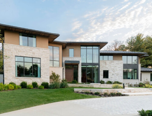
– All photos are from projects by Beth Haley Design (BHD).
Coordinate Colors in Open-Concept Designs
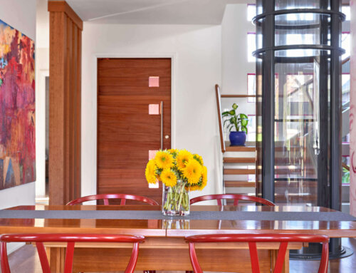
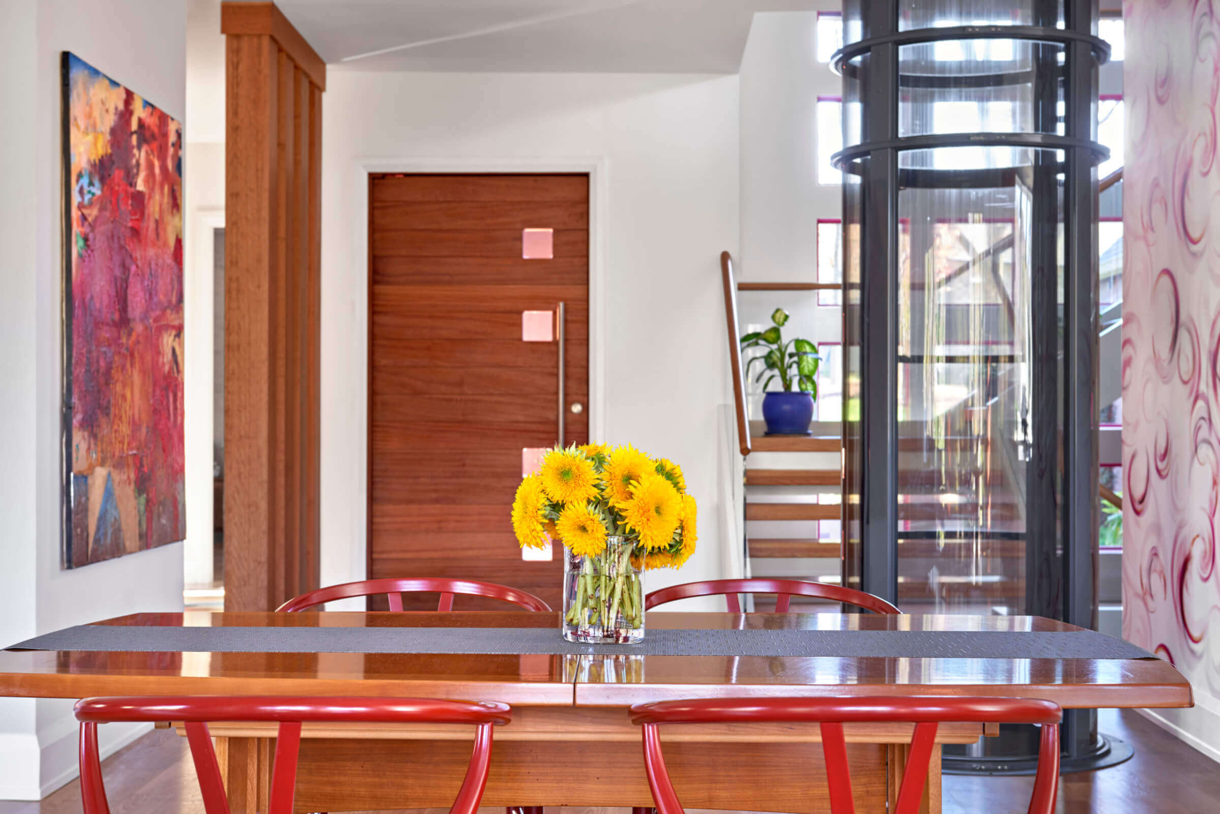
Choosing colors for an open floor plan may seem exhausting, but it doesn’t have to be. Pick shades that harmoniously flow together. We love how the bright blue details in this open-concept kitchen coordinate with the wood paneling and red door. When transitioning between colors, let the architecture of the room guide you. Look for corners and transition areas for natural places to stop and start a specific color.

Don’t let open-concept designs deter you from using color!
Save Bold Colors for Smaller Spaces
Color can be a powerful design element at your disposal when accenting or highlighting features in your home. We love using bold and bright colors because they can be so much FUN! Pick your favorite shade and start small, like with an entryway, a powder room, or a closet. Or, maybe add a vibrant backsplash to your kitchen. The possibilities are endless!

This pastel powder room packs a punch!
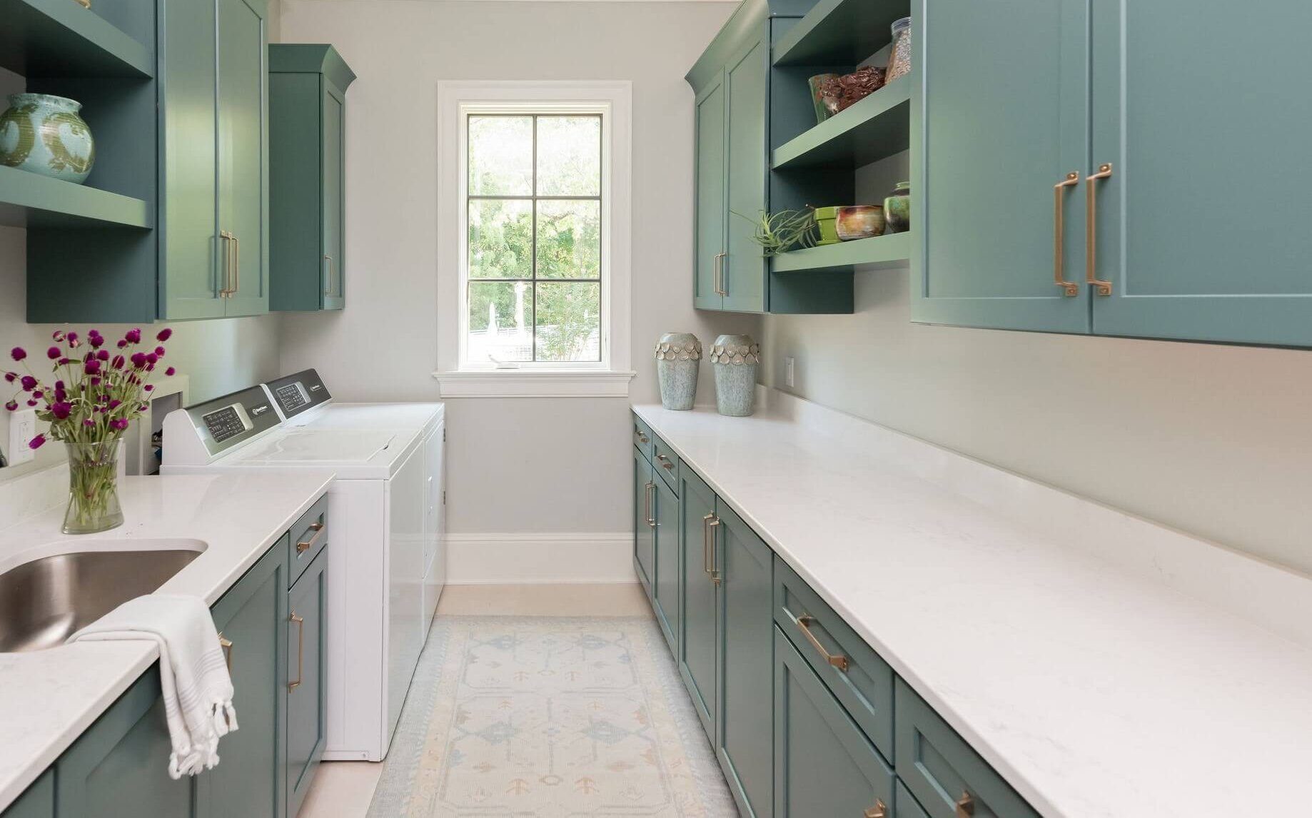
Use Neutral Colors to Your Advantage
Don’t forget the power of a neutral shade! A neutral color, such as white or gray, can be used on trim as well as doors throughout your home to help connect various spaces. Another suggestion is to use a neutral shade on the walls of a room in between spaces with stronger colors.

Neutral shades can act as a “palette cleanser” from other bright colors.
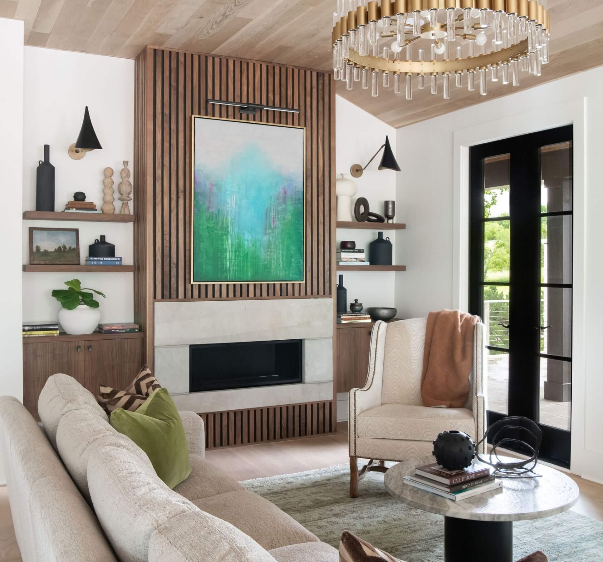
Consider How You Want the Room to Feel
Arguably, when choosing your paint color, the most important thing to decide is how you want the room to feel. Do you want it to be warm and intimate? Daring and dramatic? Clean and bright? Choose a paint color that helps you achieve the emotions you are trying to evoke. It’s also a good idea to consider how much light you have, as light affects the shades you choose. With enough light sources — both natural and artificial — you can paint a room any color you like.

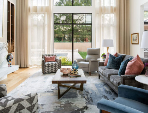
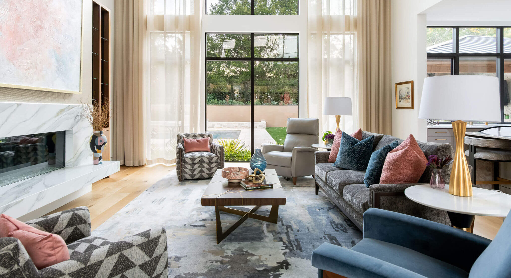
Psychologically linked to feelings of serenity, blue rooms are known for having a visually calming impact, which is why it is the perfect accent shade for this living room.
Use these tried-and-true tips when incorporating color into your home. Color brings zest, liveliness, and so much emotion. You can see why it is such an essential element of design!
Need more interior design tips? We are only a call away!
——––
Discover more of our blog posts here. We cover everything from color and mixed metals to our favorite Nashville spaces, and more!