

Although it plays a prominent role in the season ahead, red isn’t reserved for the holidays. The hue, with its bold nature and striking shades, is beautiful every time of year.
For Beth, it’s a color closely associated with deep passion and intensity — making it a polarizing shade in the world of interiors. The designer tells us, “a little goes a long way in modern design;” and she warns that “it is best when used as an accent.” Would you dare to give it a permanent place in your home?
“Personally, I love seeing a touch of red during the bleak, grey months of winter,” she continues. “A lone cardinal standing against a snowy backdrop is a dreamy sight to enjoy while I stay safely inside cozied up to a roaring fire.” We couldn’t agree more.

When reaching their peak vibrancy, fall trees feel festive. They signal the start of fall, which means winter is right around the corner. When decorating for the holidays, consider pulling the color from nature. Holly berries and maple leaves are Beth’s go-to’s.

Beth takes a less-is-more approach when decorating with red. Incorporate the color on a piece of furniture, in smaller decorative pieces, or to highlight architectural features. The color feels right at home here on a set of chairs.

Cherry season comes and goes far too quickly (in our opinion). The lush red berries first make an appearance in early spring and remain in season until early fall. Now is the time for pumpkin pie, but we will count down the days until we can dig into a cherry filling. What’s your favorite pie?

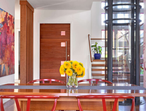
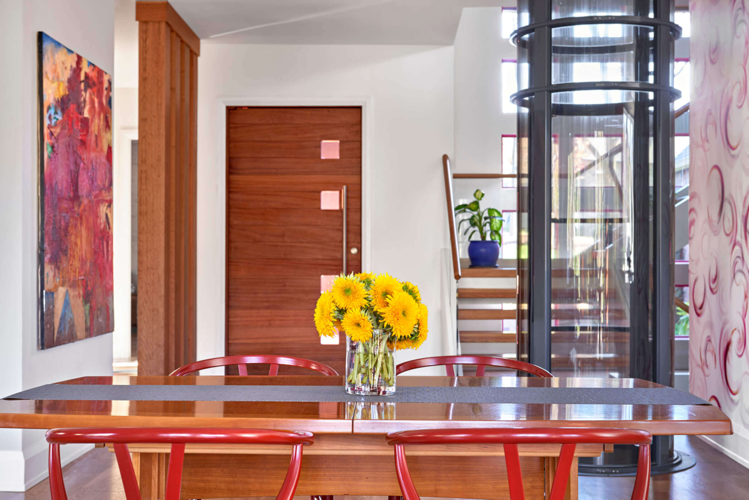
Another of Beth’s projects, this kitchen incorporates playful pops of red to reflect the homeowners’ cheerful personalities. Candy apple red appears on the chairs and in the art that hangs above the table, as well as on a beam in the kitchen (not pictured here).

Mara Hoffman took our breath away with this lovely design in the most approachable variation of the color red. Hints of orange, slight notes of salmon, and rich reds come together in this beautiful shade. A little red dress is a holiday must-have.

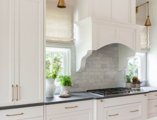
A coat of tomato-y red paint feels right at home in this kitchen, designed by Beth Haley. The soupy color pairs nicely with the sleek grey cabinetry. If you have reservations on bringing red into your space, start with a small area — as Beth did here.

Our favorite bottles of red wine deliver delicious colors that look delightful in interiors. A burgundy red brings warmth while a velvety pinot noir is daring — cheers to the many different shades of red, from merlot to ruby.
————
If you bring red into your home over the holidays, consider leaving it there year-round.
Want to know more colors Beth loves? Navy blue, peach, and chartreuse green are on the list! Discover more of our blog posts here. We cover everything from color to coffee table books to functional design, and we can even help you discover your design style.


